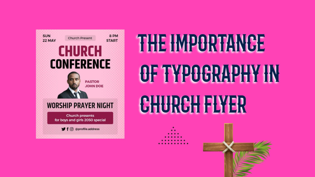
In the realm of design and visual communication, typography plays an irreplaceable role, particularly in church flyer design ideas. While often overlooked, typography carries profound significance in effectively conveying messages and evoking emotions in the reader. In this comprehensive blog, we delve into the crucial aspects of typography in church flyers, exploring its impact, principles, and best practices to create compelling and influential designs that resonate with the target audience.
Introduction: The Power of Typography in Church Flyers
Typography is the art and technique of arranging type to make language visible. In the context of church flyers, it involves selecting, arranging, and presenting text in a visually pleasing and impactful manner. Church flyers serve as powerful tools for outreach, conveying vital information about events, sermons, community initiatives, and more. The design of these flyers greatly influences how the message is perceived and received by the audience.
A well-crafted church flyer has the potential to capture attention, spark curiosity, and inspire action among recipients. Typography, as a key element of the design, plays a pivotal role in achieving these objectives. By choosing the right fonts, sizes, and layouts, designers can amplify the impact of the flyer, effectively communicating the intended message and strengthening the connection with the target audience.
In this article, we explore the various ways typography influences the perception of church flyers, the principles that guide its effective implementation, and the best practices to create visually appealing and engaging designs.
The Impact of Typography on Perception
- Establishing Visual Hierarchy
Typography allows designers to create a visual hierarchy, guiding readers through the content in a structured and intuitive way. By employing various font sizes, styles, and colors, important information can be emphasized, ensuring that the audience grasps the core message at a glance. For instance, event dates, times, and locations can be highlighted prominently, enhancing the flyer’s overall effectiveness. - Conveying Emotions and Tone
The choice of fonts can evoke different emotions and set the tone of the message. In a church context, serif fonts may convey a sense of tradition and formality, while sans-serif fonts often evoke modernity and simplicity. By matching the typography with the intended emotional response, the flyer can connect with the reader on a deeper level. Typography is the art and technique of arranging type to make language visible. In the context of church flyers, it involves selecting, arranging, and presenting text in a visually pleasing and impactful manner. Church flyers serve as powerful tools for outreach, conveying vital information about events, sermons, community initiatives, and more. The design of these flyers greatly influences how the message is perceived and received by the audience. - Improving Readability
Legibility is paramount in any design, and church flyers are no exception. By selecting appropriate fonts, ensuring sufficient contrast, and spacing text optimally, designers can enhance readability. This becomes especially important as the flyer may be viewed in various settings, such as on bulletin boards or social media platforms.
Principles of Effective Typography in Church Flyers
- Selecting Appropriate Fonts
When designing church flyers, it is essential to choose fonts that align with the purpose and message of the event. For formal occasions, elegant and classic fonts may be preferred, while contemporary events may benefit from more modern and creative typefaces. - Limiting the Number of Fonts
Using too many fonts can lead to a cluttered and confusing design. It is advisable to stick to a maximum of two or three complementary fonts to maintain consistency and harmony throughout the flyer. - Paying Attention to Font Size and Spacing
Proper font size and spacing significantly impact readability. Avoid using fonts that are too small, particularly for important information, and ensure adequate spacing between lines and paragraphs to enhance legibility.
Best Practices for Typography in Church Flyers
- Captivating Headlines:
Catchy and keyword-rich headlines are crucial for grabbing the reader’s attention. Utilize bold and impactful fonts for headlines that convey the core message of the event. - Incorporating Images:
Visuals complement typography and reinforce the message. Incorporate relevant images that align with the event or sermon theme to enhance the flyer’s overall appeal. - Using Contrasting Colors:
Select colors that contrast well with the background and each other. This ensures that the text stands out, making it easier to read and understand. - Aligning Text Purposefully:
Justified and centered text can add visual interest, but they may affect readability. Align text purposefully based on the flyer’s design and content. - Incorporating Call-to-Action (CTA):
Encourage engagement by including a clear and compelling CTA. Whether it’s to attend an event, join a community initiative, or visit the church’s website, the CTA should be prominent and actionable.
Conclusion
Typography in church flyers is far from a mere visual element; it is a powerful tool for conveying messages, setting the tone, and creating a lasting impact on the audience. By understanding the principles and best practices of typography, designers can create compelling and influential flyers that resonate with the community.


